
Dr Martens – Navigation
Project impact:
5.4% increase in conversion in the US and 4% in EMEA, where add to bags have also been significantly up by 2.1%. 7-digit scaled annual impact on revenue.


Research phase:
*
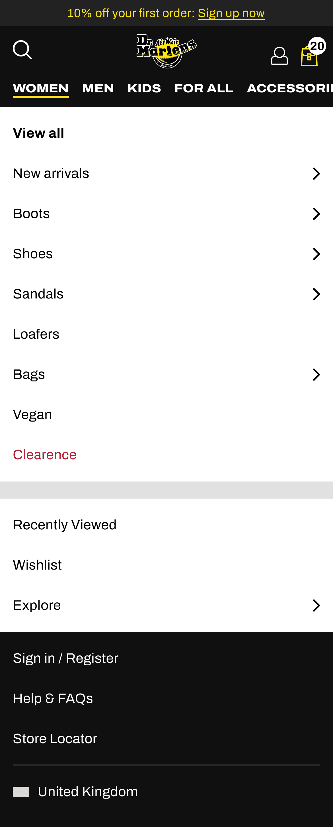
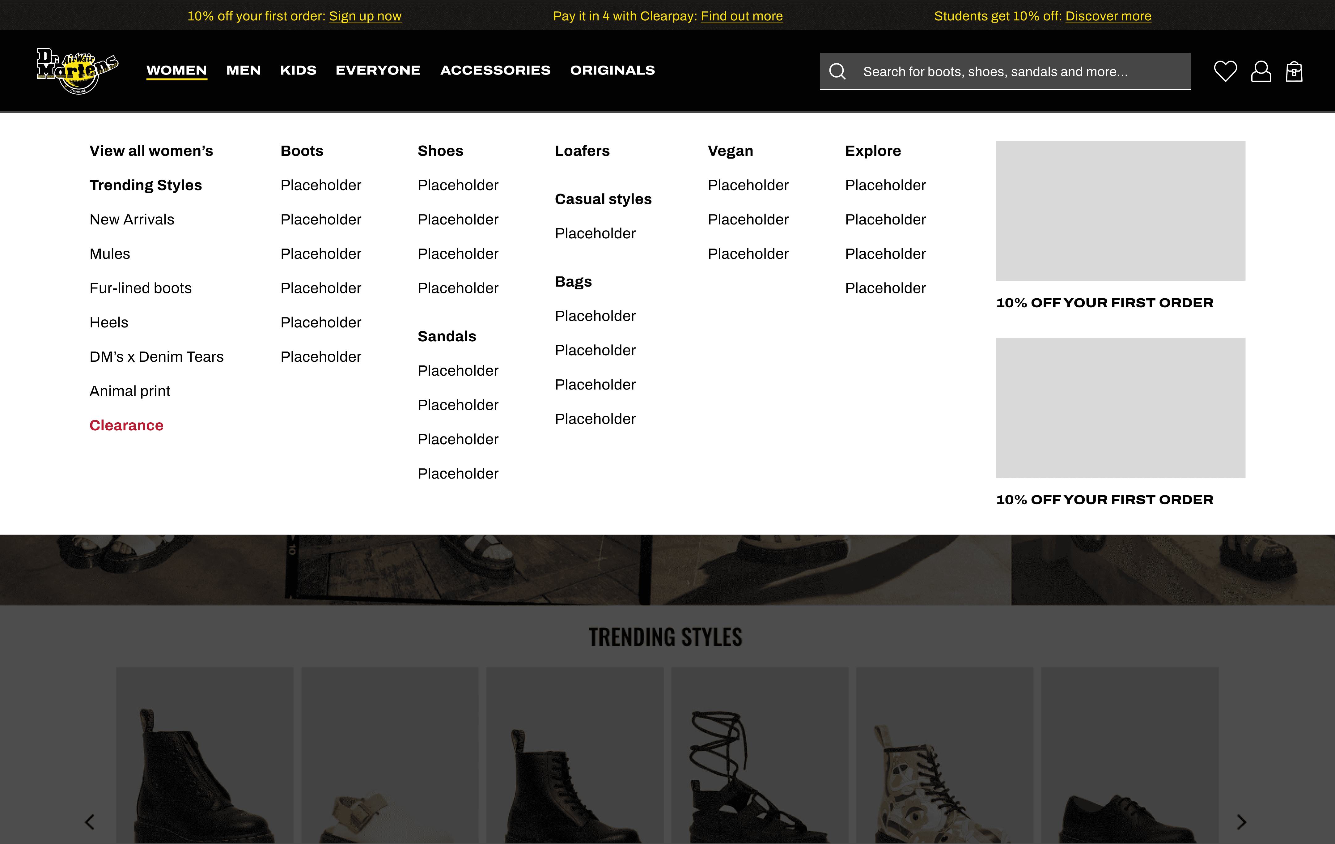
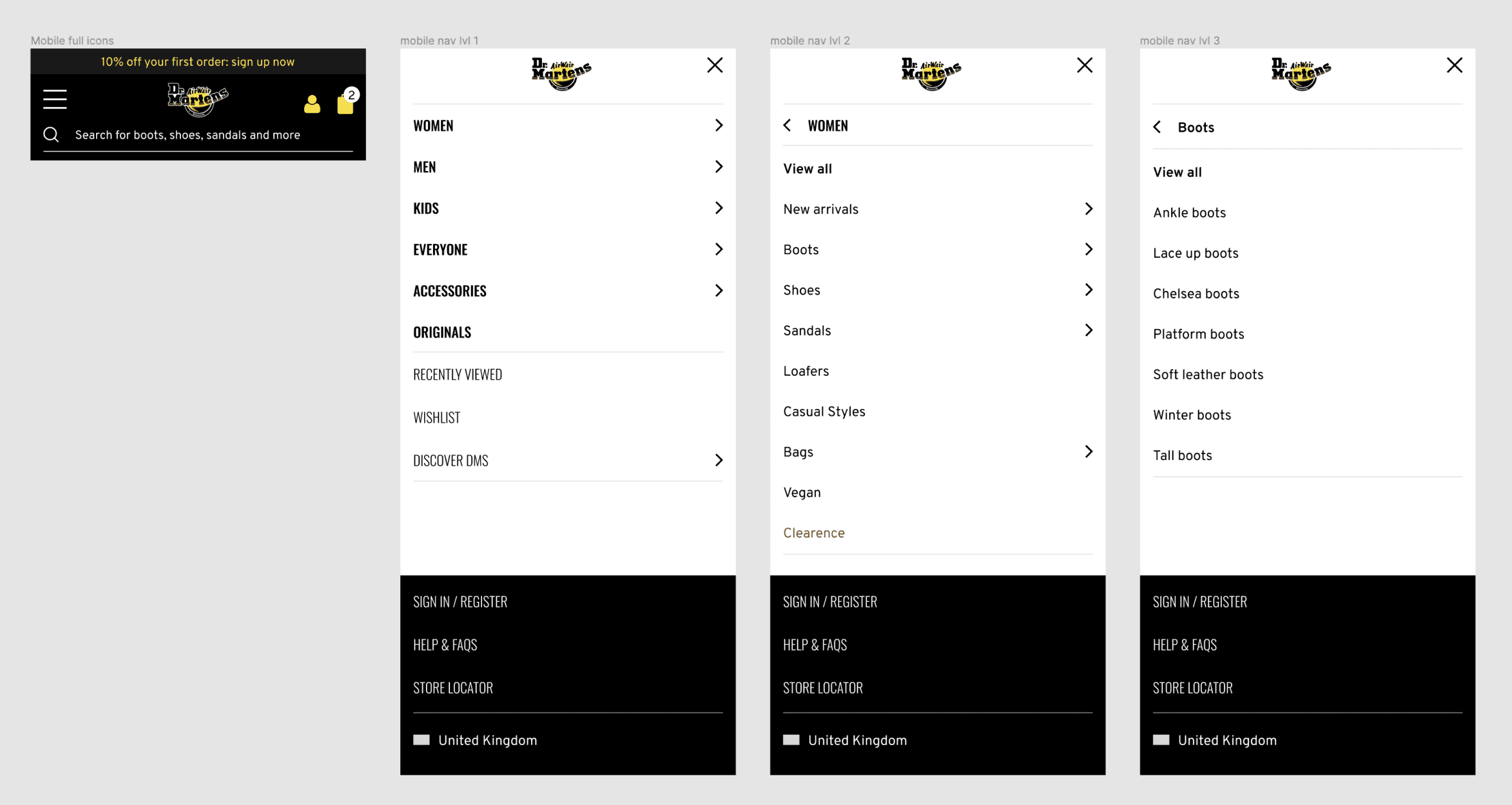
Navigation had 199 menu items, causing choice paralysis, accessibility issues for screen readers and operational gaps including categories with 0 results
*
Audit against Baymard best practice showed major misalignment: >10 subcategories, overlapping categories and PLPs with fewer than 15 products
*
Performance data highlighted waste and friction: 100 links at ≤0.01% CTR, Explore section at near-zero engagement and header wrapping for 15% of desktop users
Testing phase:
*
Reduced categories from 199 to 71 with SEO sign-off to improve clarity and scanability
*
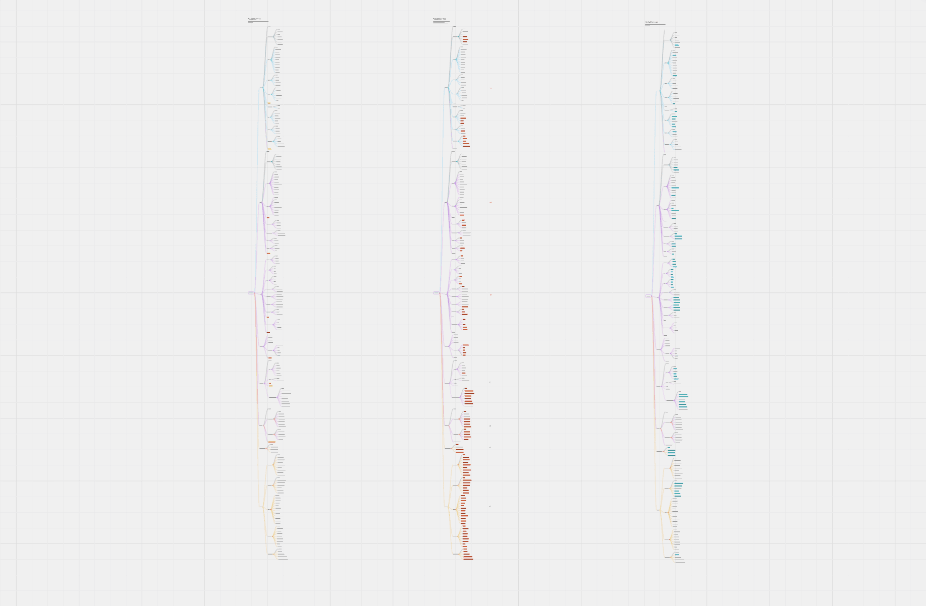
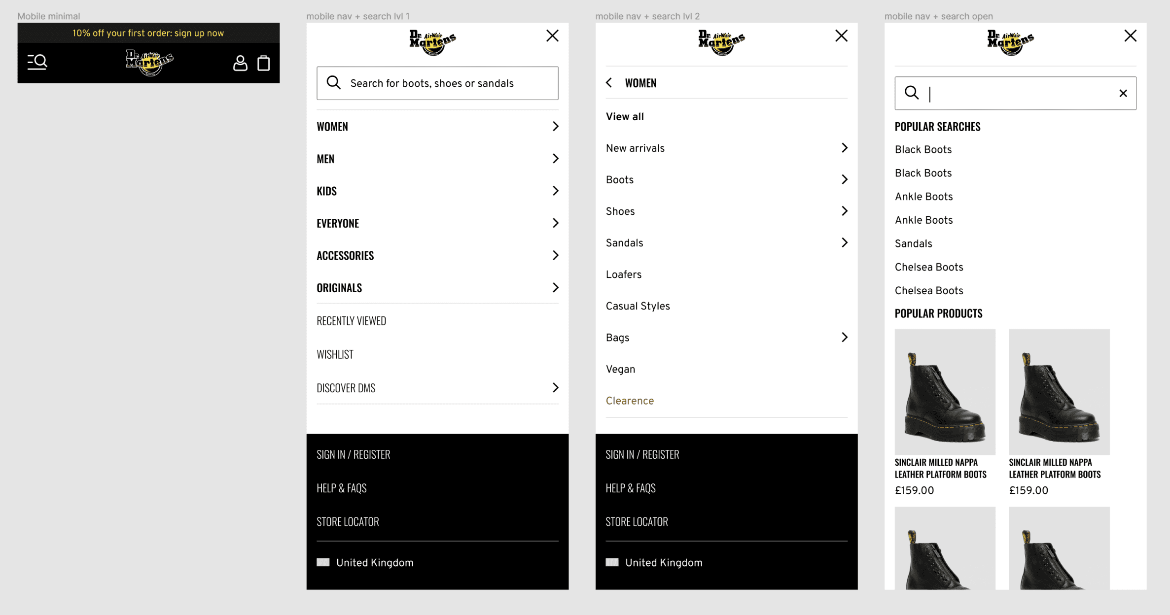
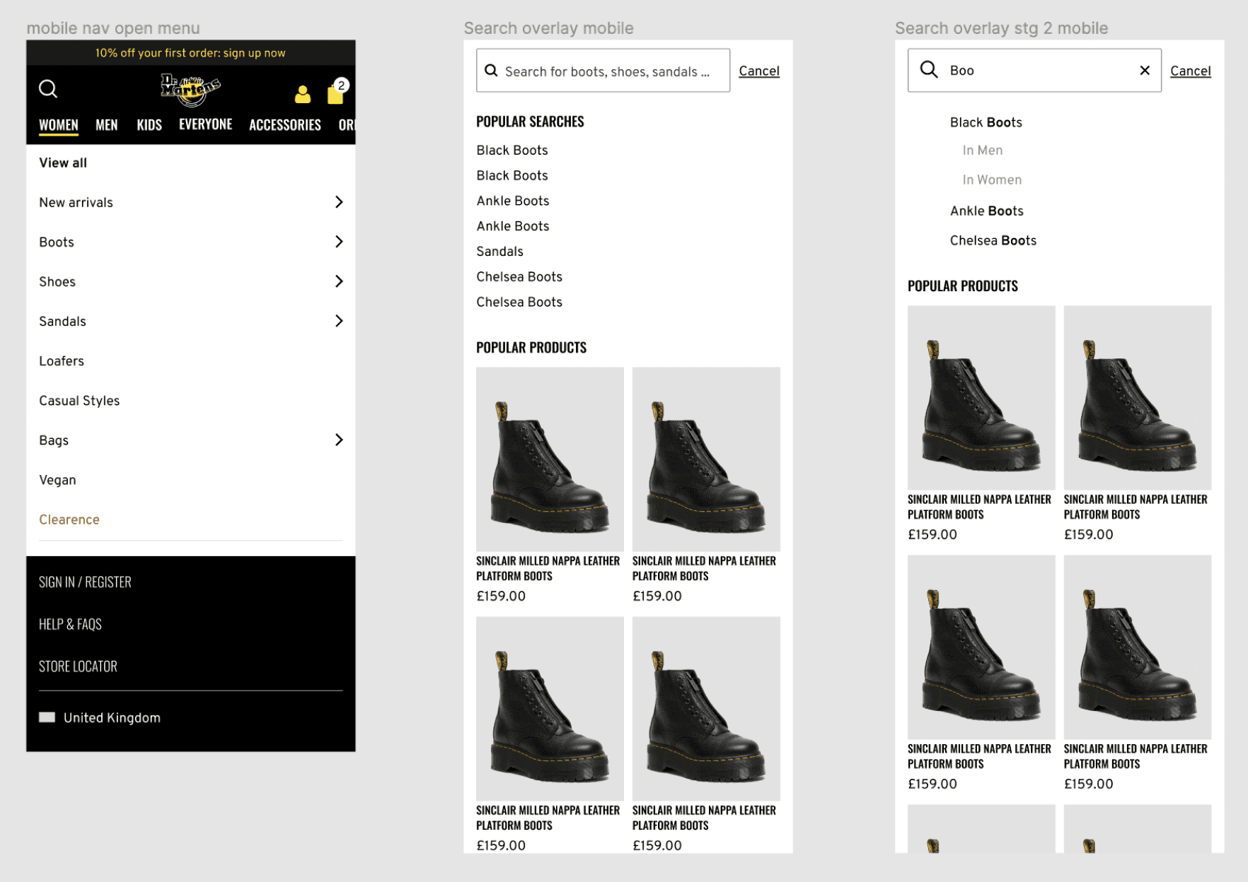
Tested 3 navigation variants combining hamburger, open nav and search in different configurations
Results & implementation:
*
Open navigation variant won, increasing engagement even though search showed higher conversion most likely due to intent bias
*
Partnered with product, SEO and engineering to refine the solution and align desktop to the new mobile-led UI
*
Rigorously QA tested and worked with front-end development to ensure pixel-perfect delivery