
Penhaligon's – Checkout


Phase 1:
*
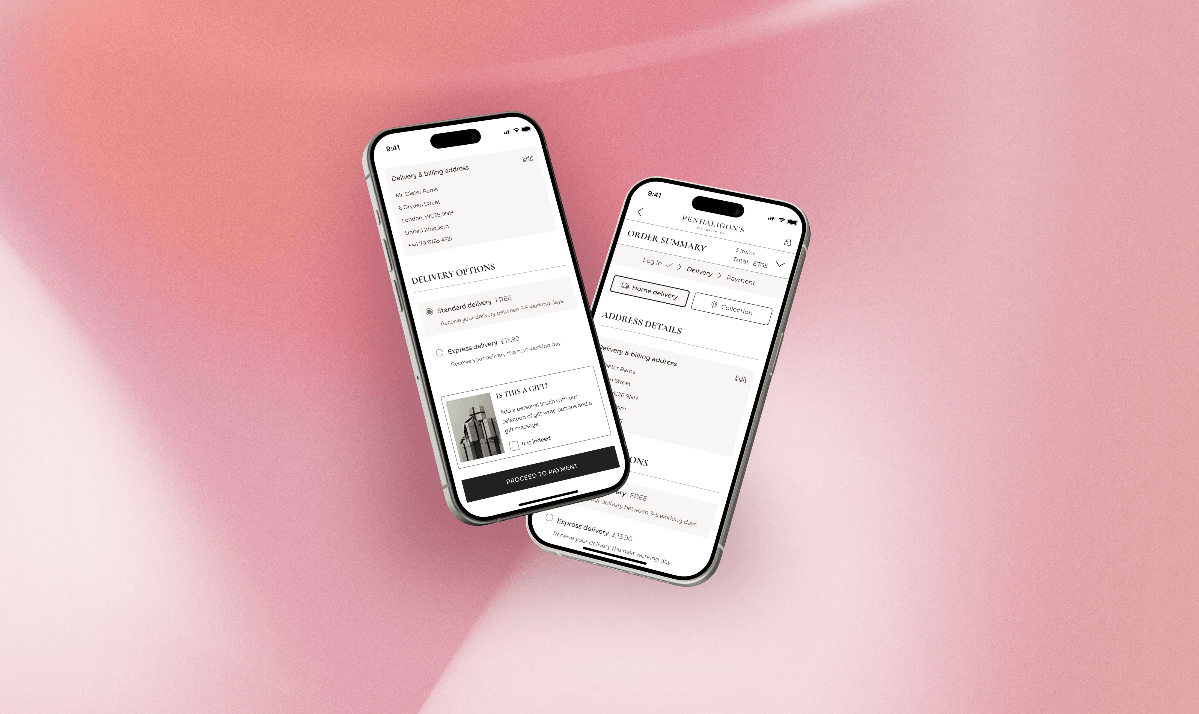
Vertically stacked steps (hidden on mobile) are now a clear sequence of pages, indicated at the top
*
Login step was taking users too long. We’ve prioritised the guest journey over logged-in following the Baymard Institute's guidelines
*
Shipping stage had the highest drop-off, especially the country field which is now pre-filled and collapsed
*
Optional fields have been collapsed in the delivery form and unnecessary steps to get to payment have been removed
*
Separate review stage caused drop-off, so it’s now merged into the payment step
*
My team and I built a flexible solution rolled out across three white-label brands: Penhaligon’s, L’Artisan Parfumeur and Kama Ayurveda.
Phase 2:
*
Users leaving the title field empty converted 12.5% less, so the field will now be optional
*
Single-field login that auto-recognises accounts boosted CVR by 9%
*
Pre-selecting card payments cut payment page exits by 5%
*
Baymard research shows users hesitate to proceed if they don't know gifting is available, so we’re moving it to cart
*
Error messaging improved: making the CTAs active and scrolling the user to the highest error on click. Errors no longer shown whilst typing.
*
Expanded the changes to 4th withe label brand